
Evolving the Look & Feel of a Legacy Prenatal Brand to Renew Market Presence
VitaMedMD Prenatal Vitamins (via TherapeuticsMD), 2020
INFO
vitaMedMD is a brand of prescription prenatal vitamins and supplements supporting the nutritional needs of pregnant and breastfeeding women — one of four major brands I created collateral for during my time at TherapeuticsMD. The brand hadn't been updated in years and had stopped standing out in consumers' minds, so my creative director assigned me to refresh its look and feel from the ground up.
I researched the prenatal market and read through mommy blogs to understand what resonated, aiming for something organic but modern, a look that captured the mix of hope and care that comes with expecting or planning for a child. I updated the logo, color palette, typography, and icon set, and designed illustrated patterns inspired by the leaves in the original logo. Once my creative director approved the direction, I carried it through a direct mailer booklet, leave-behinds, flyers, and social media creative.
SKILLS
Brand Refresh · Logo & Identity Design · Market Research · Illustration · Print Collateral · Social Media Creative
First, I audited the existing and legacy marketing materials for the brand, and presented ways I thought it could be refreshed without changing its core identity and making it completely unrecognizable. I identified possible updates in the textures, photography, and colors that could be made in order to evolve the brand look and feel. Once this new direction was approved by my Creative Director, I was able to move on to development.
DISCOVERY
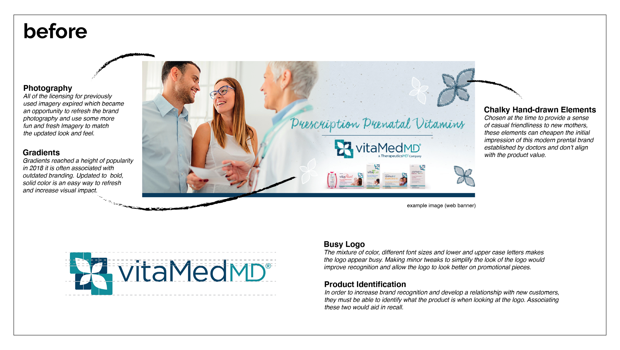
The intention behind the new direction was to modernize the brand and visually drive home what these prenatal vitamins would really mean for expecting parents and to make them feel that they could relax into their joy knowing they were making the best choices for their child. The calming blue color scale, organic imagery reflecting the leaves in the legacy logo, high contrast icons, and more cinematic and moving photography could provide this elevated connection to real life experiences.
DEVELOPMENT
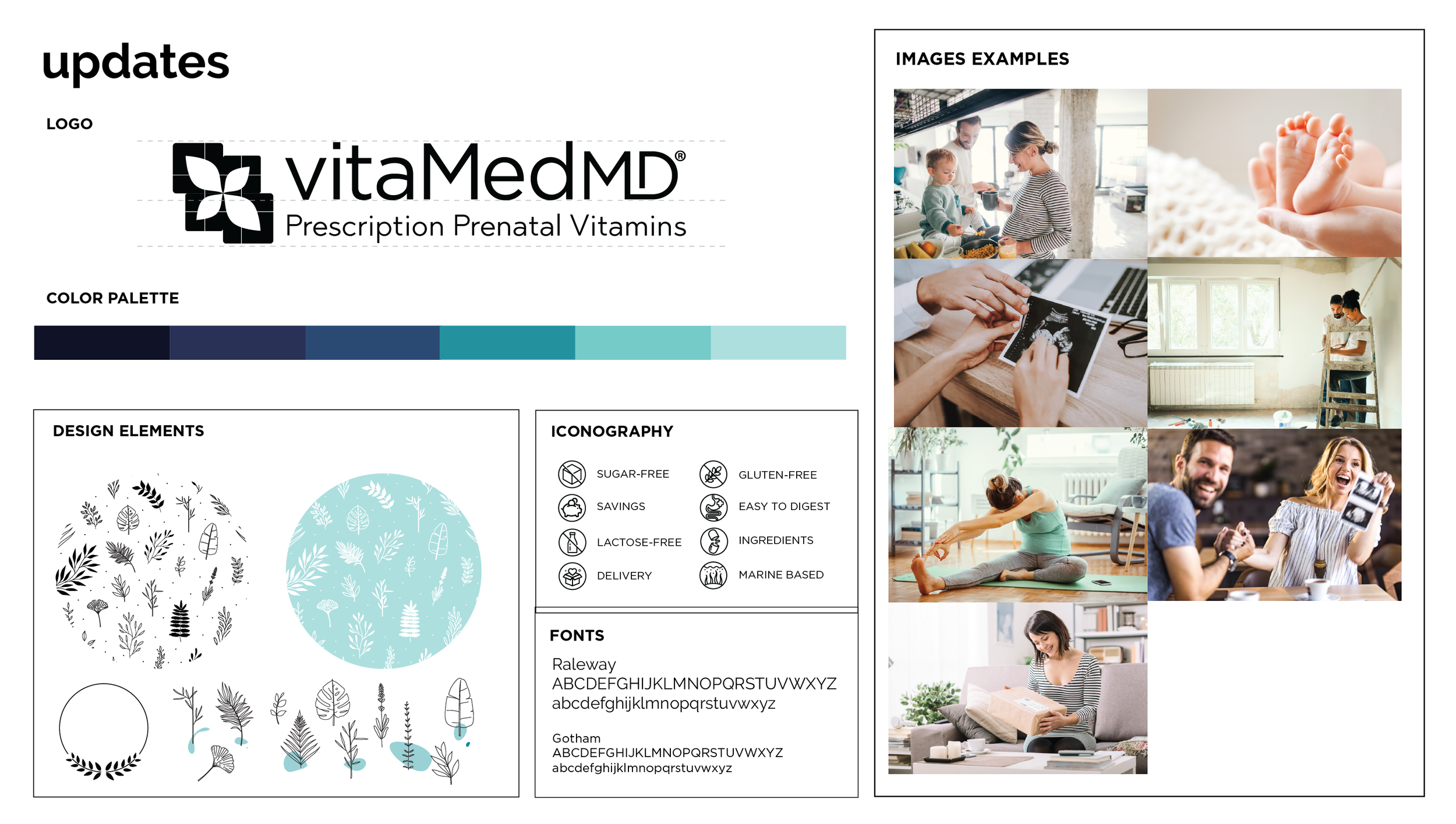
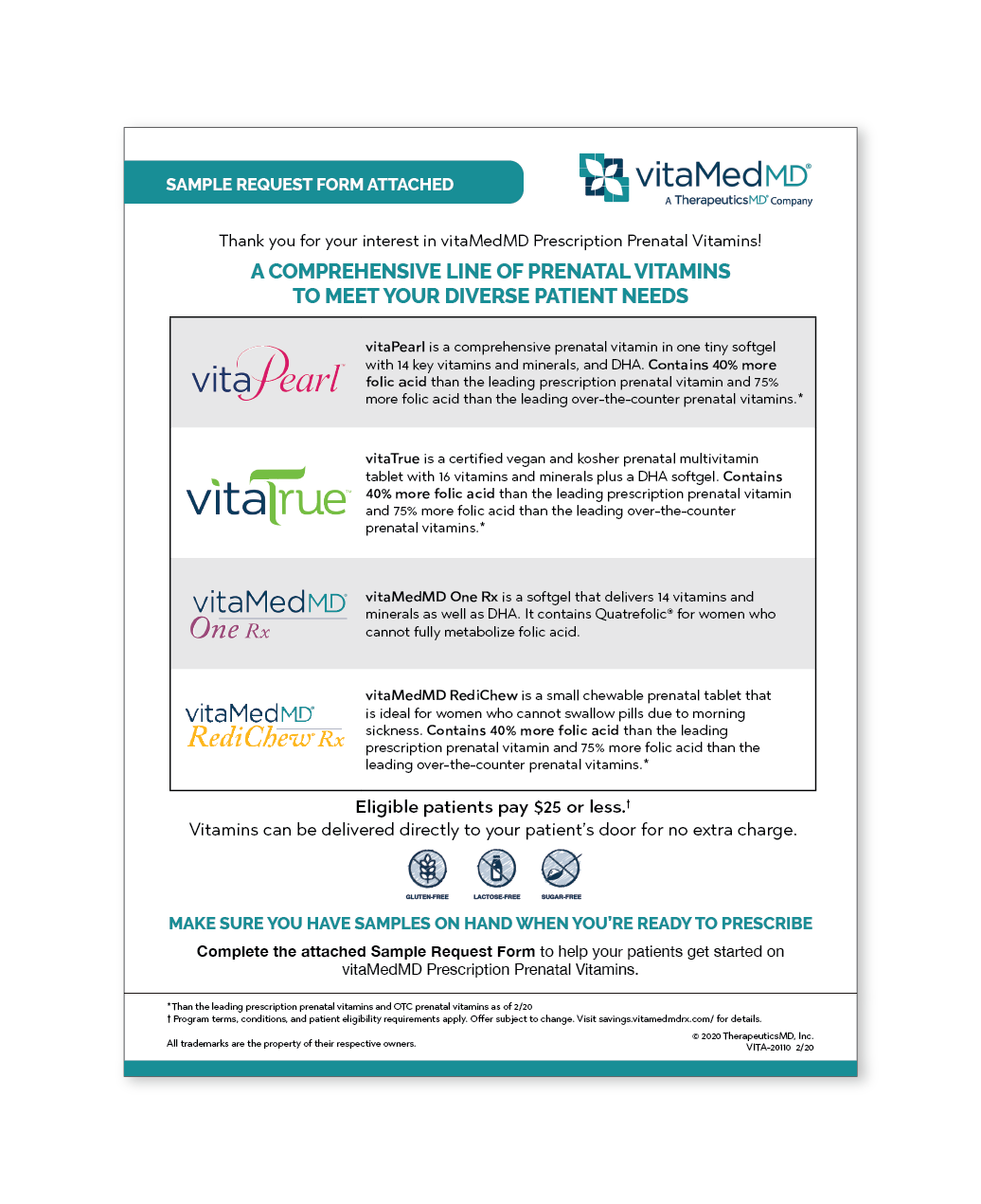
I was then able to apply this new look and feel across many touchpoints including a Direct Mailer, Flyers, Leave Behinds, Data Sheets, Sample Requests, and Social Media.
DELIVERY & DISTRIBUTION
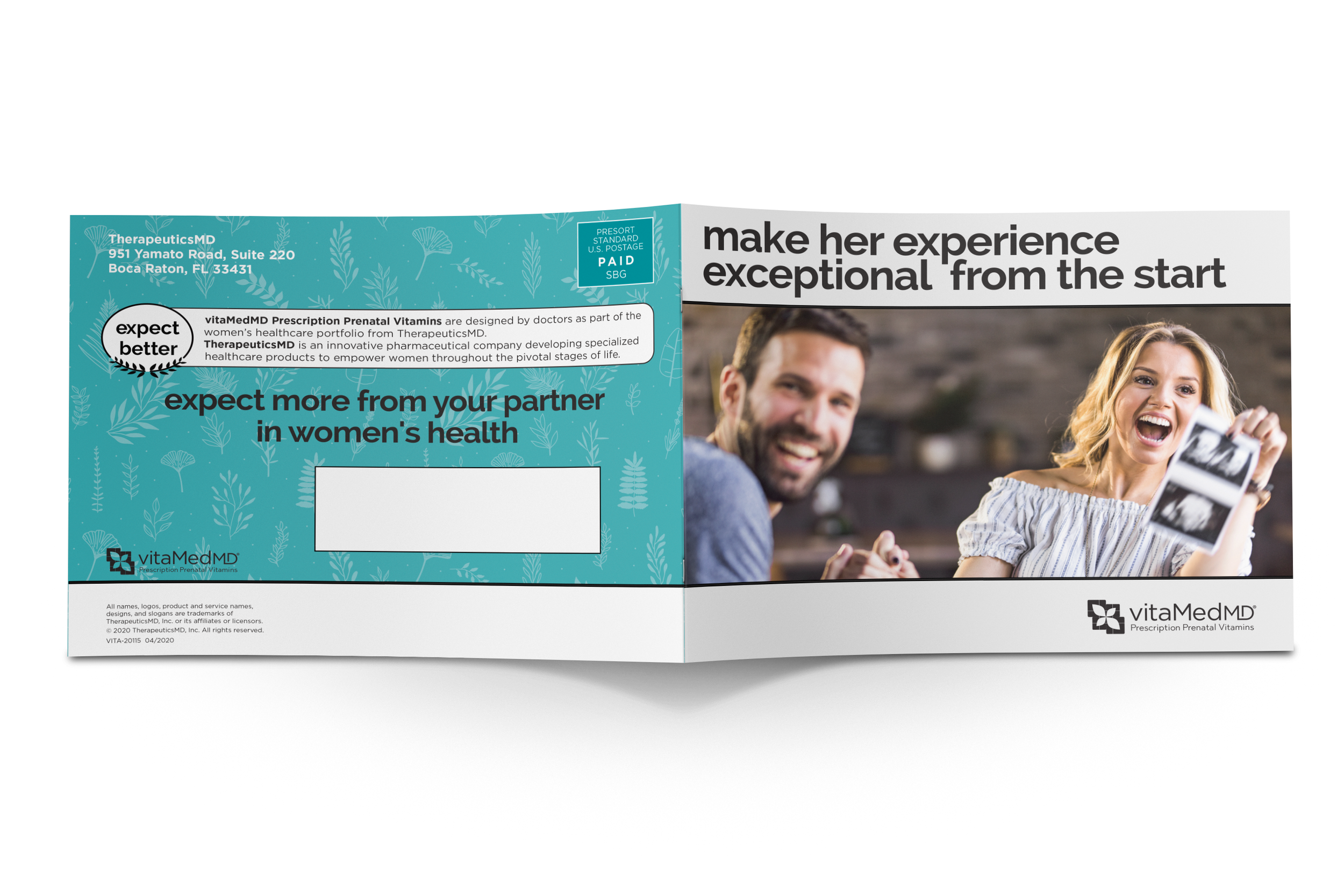
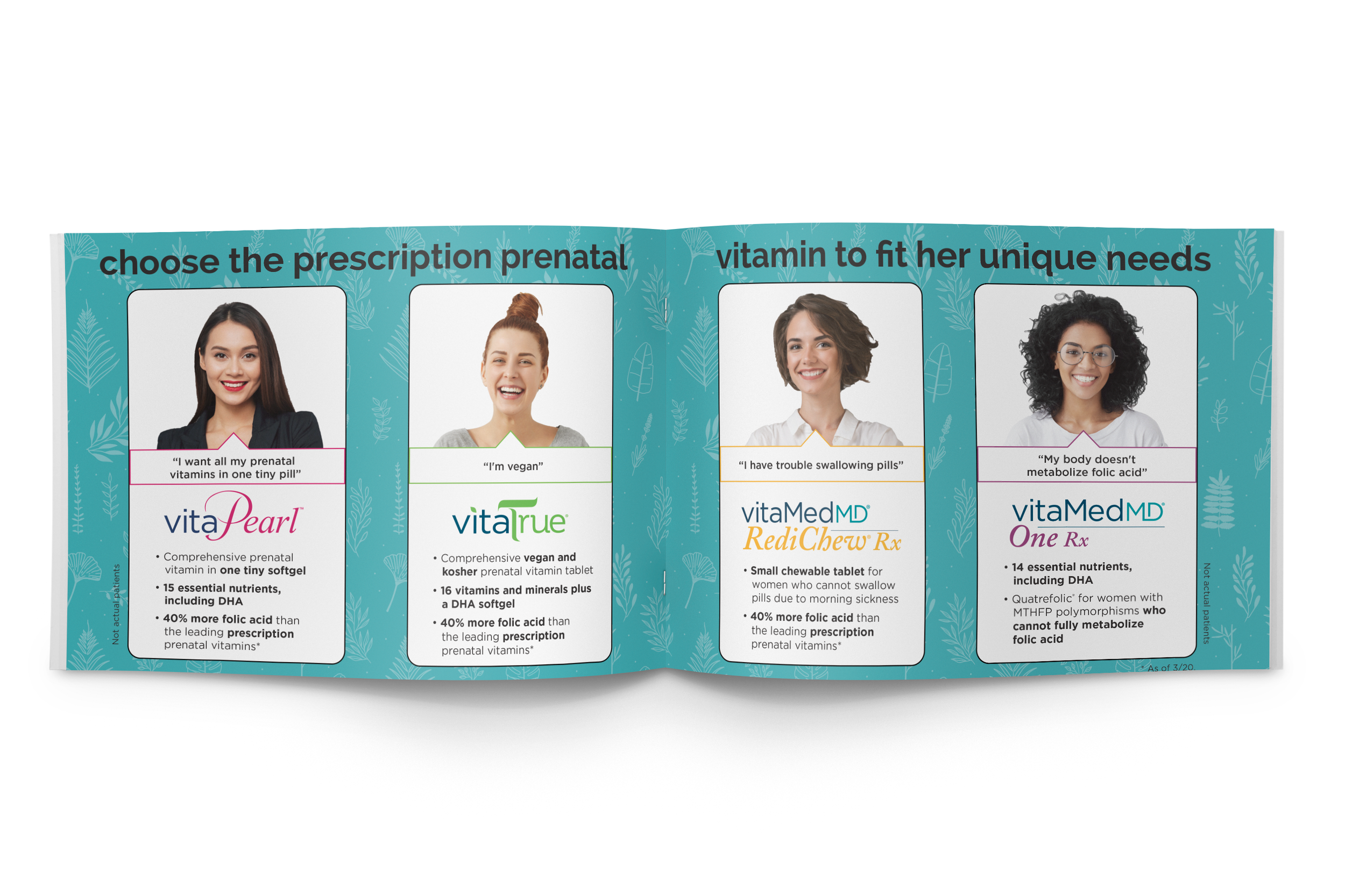


Direct Mailer Promotional Booklet
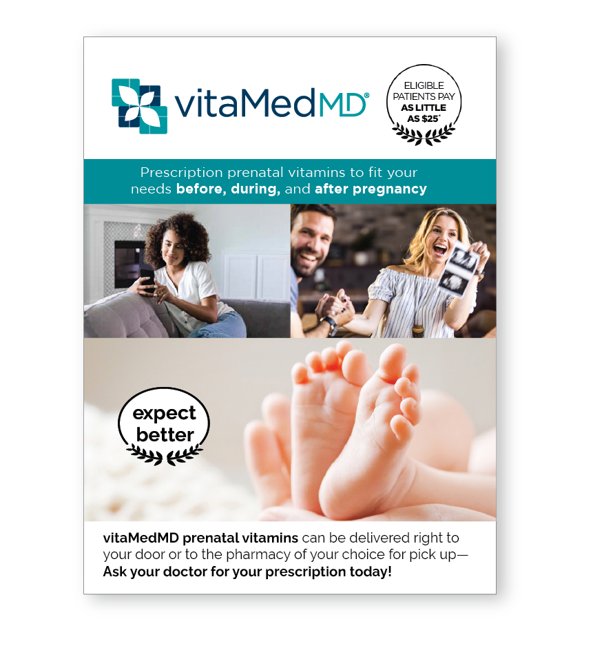
Leave Behind Flyer
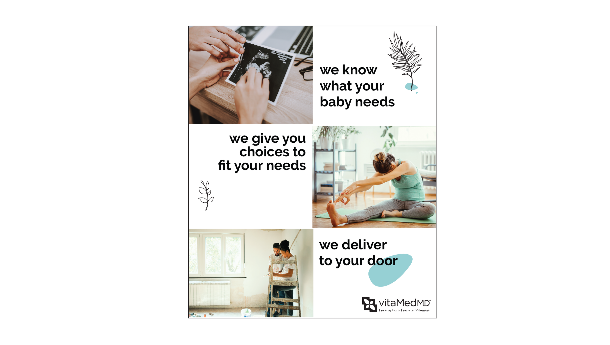
One-Page Ad
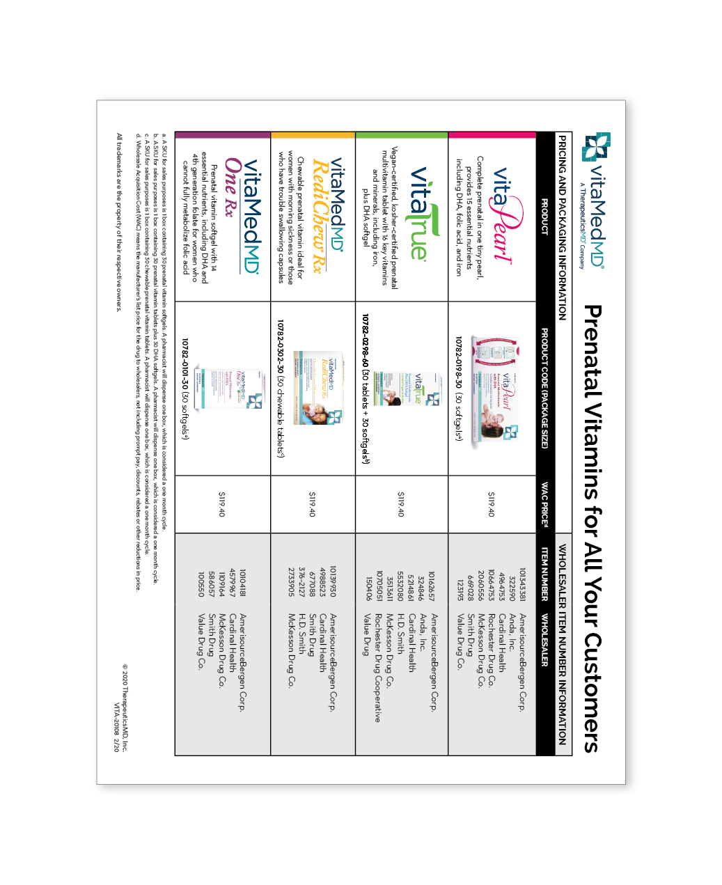
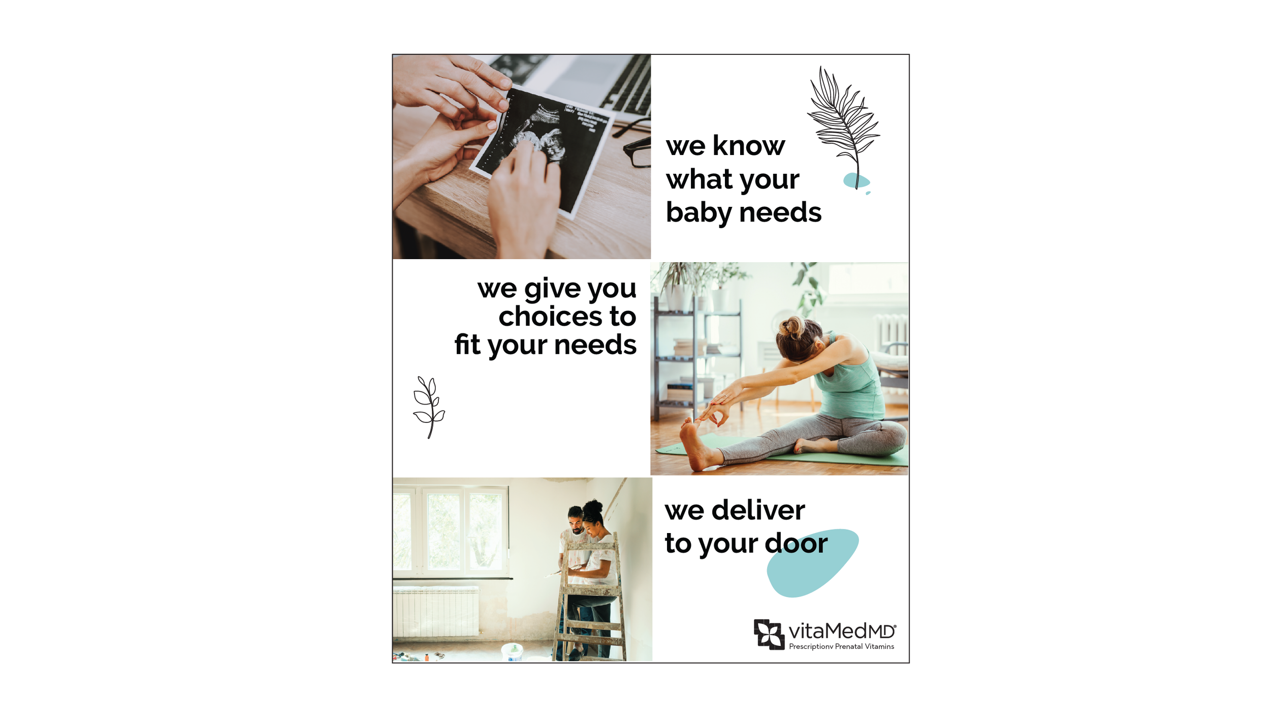
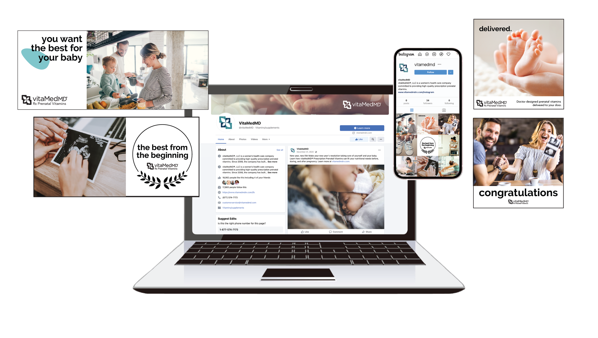
Digital Deliverables - Social Media Branding, Posts, and Digital Ads